As I had done a lot of the sketches now, I went onto Photoshop to start creating the digital wireframes.
Brochures
I started with the brochure page. I created a simple header and navigation based on my sketches which I was happy with for now, and went straight to designing the page. I copied my sketch, and was happy with it but I knew it could be improved.
I didn't like the big text on the right - it seemed too imbalanced with the imagery on the left. It should be supporting the image, not being the main focus.

I also tried having a smaller brochure either side of the main one to see how that would work. But I felt it was too cluttered, and it didn't really need it with the mini thumbnails underneath the main one.

I tried making the text on the right smaller but it was still too big

So I tried to make that box smaller and have the mini brochures go across the whole page width, but it felt even more unbalanced then.

I made one of the mini brochures darker to show this would be highlighted when the branding is in

I went back to the arrows as I felt the side brochures to be too overpowering

Instead of the text at the side, I added a form instead so people can request/download a brochure without having to actually click on the buttons first - makes it smoother/quicker for the user

I made the buttons above each other too, like on the app. I also made the background of the brochure lighter so that the brochure stood out more. I also added a caption underneath the brochure. I also added social media icons to make it more realistic + advertise how much they use it

I then moved the caption to the side as I felt it wasn't in the right place before underneath the brochure - it fits in better here and works better with the hierarchy

I added an underlined tab under the Brochures link in the navigation, to show how an active page would look, it also matches the app

I tried adding a filter icon to the nav, as I felt this might work with being able to search for a trip
I then added more links to the navigation to show all the relevant content that should be included on the site. I feel like this page is finished now!

Filter
I started working on the filter for the search for a trip option
I started playing around with how the drop down menu would look on the form

I thought about adding numbers to show how many trips are available

I started to create the form based on my sketches which was working out wel

I was really happy with how this part of the form looked, but I was still unsure about the map and how it would work

I began by creating a visual map and identifying the continents on it
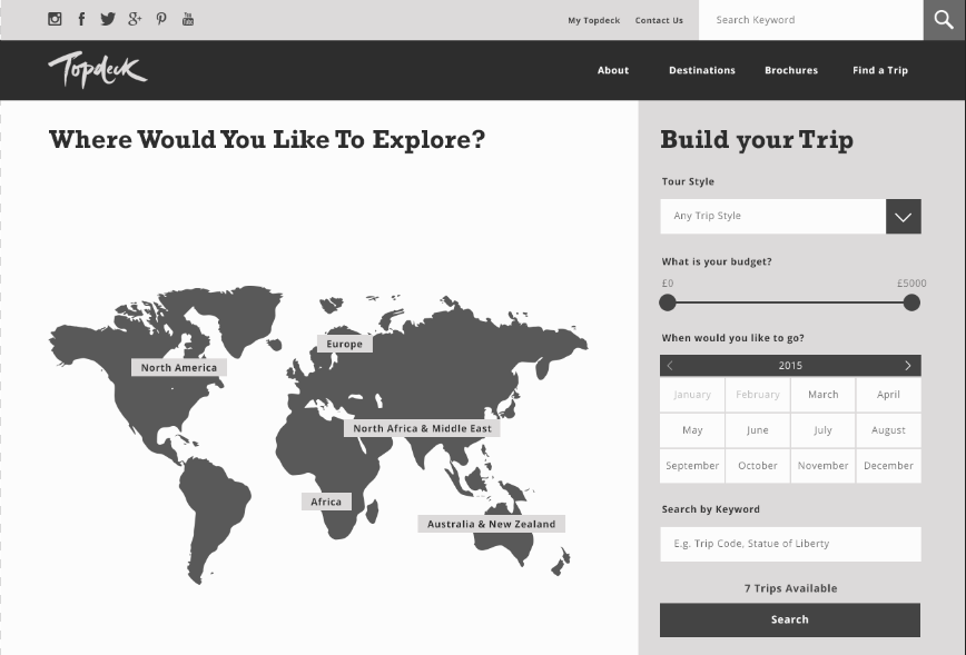
I also added a search bar so users can type in the country they want to visit more specifically

Since this is also on the home page, I began to think about what would go underneath it. I wanted to include the latest deals, so I began doing this

I quite like how the deals have turned out, it is different from what you would usually see on a website as they are usually quite garish
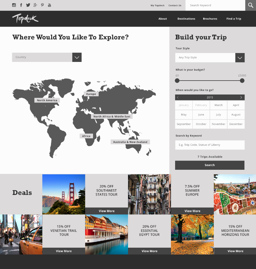
I made the background of the deals lighter so the text on them stood out more

I also made the deals box longer, so that I could fit in 'Latest' and also each deal had a picture each, as before it was unbalanced

Back to the filter, I decided to start creating the hero image - what would appear at first when the filter is closed. I chose a striking image of New York to draw people in

I feel like it is starting to take shape and look really structured

I also highlighted Find a Trip in the navigation so the user can see they have it open

I started to play with text over the hero image

I feel their brand text of Rockwell works well over it

I thought about having just a dropdown menu on the right asking people where they want to go as I was struggling with the map idea - but I came back to this and figure a way around it as it could be a great part of the site

I started working on what would go beneath the deals - travel inspo. This would be ideal for people who didn't know where they wanted to go yet and are open minded to what is available to them/what Topdeck recommends

I started to add headings to the images to give users more of an idea of what they are about. It just includes the destinations, a short caption about it in their conversational tone of voice and a link to more info about it

On the slider, I tried to think of different ways to show there is more than one image available to the user. I thought having big numericals and the heading as a caption would give more context to users and is just a different way to display the info

I like how gridded the website looks, it has a contemporary feel to it

I decided to go back to the map and make it work, as I wanted to make it interactive and fun for the user. I wanted a way for users to click on the map and be able to draw their own route - I feel this is a unique feature on the site which makes it worthwhile making (although it was hard to figure out!)

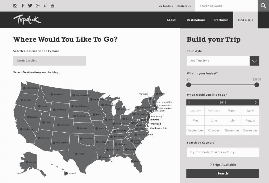
I decided that if the user types in an American state for example, or clicks on North America on the world map, the map would zoom into a map of the USA

I began to add all of the states to this..

Once I added all of the state names I could start to develop it further

I added pinpoints to all of the states to make it easier for users to click on them and draw a route through them. The user can click on pinpoints, and they will join up together so users can search for trips that include these in them - above the search button is a piece of text saying how many trips are available, so the user can see how their decisions affect this.
I created the footer for the site, and wanted to include social media as well as the newsletter. I kept it simple and easy for users to understand

I was also going to have a blog on the home page, but I decided to scrap this as it isn't really necessary with the hero image slider content and travel inspo

Leave your comment