As I have done a lot of sketching for the app now to figure out what to include and what it should look like, I decided it was time to start doing digital wireframes. Throughout this process, I kept going back to the drawing board to refine my ideas.
Log In
I wanted to keep the log in and sign up page clear and simple. I also wanted to give an idea of the brand and how fun it is, so I combined a photograph of one of the destinations Topdeck go to (Yosemite) with their logo to show this. I used a clean design for the form to go with the new branding they have undergone.

I thought it would be a good idea to be able to sign in with social media due to them using Facebook a lot and this makes it easier for people.
I thought it would be a good idea to be able to switch between log in and sign up using the two buttons at the top, and using a fill colour to show which one you are on.

Destinations
For the filter page I decided to have two tabs to make it more digestible. On the first tab, I was trying different layouts to show which destinations you can search by. I tried a list at first, and felt like it did work but it is quite boring.

I then tried photographs which bring it to life a bit more, and thought it could have a secondary tab so the user can search by country or continent.

However, I thought that that was too complicated and it didn't have to be as fiddly.
So, I decided to give users an option of clicking a photo for continent, and a search form if they want to see anything more specific.

I changed the title Search by Country to white so I know to make it a lighter colour so its more readable.

I made the underlined tab thicker so it's easier to see

I then tried a similar layout on the Explore page creating a grid of pictures

I also tried seeing what it would look like with icons to make it different from the destinations page. You would be able to fit more content on doing it in this format without the user having to scroll.
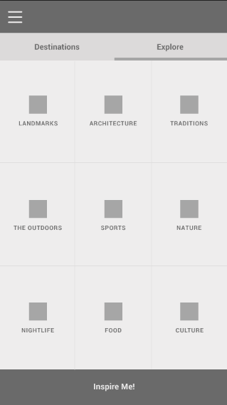
I also tried it with 12 squares but it seemed quite busy, so I think I will stick to the x9 grid.

I then tried doing the layout for the Results you see after this step. I wanted it to be very visual and easy to digest without huge amounts of content - basically so you get the gist of what it is without reading the paragraph if you don't want to.

On the header, I added the filter preferences the user selected so they know what they are looking at.
I changed the typeface of the heading here to a sans serif rather than the slab serif they sometimes use as I feel it works better in an app format.
I also saved space for a bucket icon which would allow users to add an experience to their bucket list to view later.
On the bottom tab, it shows the amount of trips this experience is available on, and so I made the number bigger as this would change depending on each experience and stands out more.

For the bucket list page I tried having a grid so the user can see experiences they chose at a glance without info. I also added a filter so they can view by grid or individual experience with more info.

I tried it without separating lines but felt this is too confusing.

I also added captions on them to describe the experience more

I tried it in the middle which I think looks better, but still not very clear

So I then tried it underneath to make it clearer which I think it does. I still wasn't happy with it so decided to come back to it later.

I then decided to work on the actual trip pages. They needed to be separated due to the amount of content they need, and I thought overview, itinerary and prices was a good breakdown.
I used the content from the brochure, and for the overview there wasn't a lot to add so I knew I needed to make this layout more interesting.

I tried altering the leading of the text to make it more appealing but it still felt boring.

I tried adding a pop of colour to the headings to see what they would look like in the wireframe stage but it still felt lacking.
I also added placeholder icons for a bucket list, and an option to switch between map and photo view.

I then added rectangles behind the headings which I thought worked better

I started playing around with the itinerary as well. This works but it is very boring, I wanted to make it more enjoyable to read.

I looked at the map they have in their brochures, and they are very fun and illustrated - I can adapt this style for myself to keep everything on brand.

I tried adding it into the itinerary, and tried the possibility of the user being able to click on the day they want, and the info coming up for that. However, this seemed too complicated for what it needed to be.

I tried both of the ideas in colour to see if it made any difference to how I saw them


It didn't, so I tried another layout. This time having a space for a picture on each day. I do like this more as it breaks it up a bit, but now it feels a bit unnecessary.

So, I tried having the map, and having the info below with long headings - these match the overview page too.

I also added a scrollbar, as I thought it would be good to be able to always see the map.

I then moved onto prices. I wanted to keep it similar to the brochure to keep it consistent with the user so they know what they are looking for in both.

I tidied up the lines so they weren't overlapping everything

I tried taking away the headings to see how that looked but it became hard to understand the hierarchy then.

As I kept thinking of new things working on each page, I went back to the bucket list to try having no headings on that as well. I do like this layout, but I'm still unsure as to whether it needs more info on it.

I went onto the Overview page of the trips, and tried to make it more spacious - I thought the user could scroll for more info

I then tried different button layouts for the bucket list page to direct people back to that experience.

I also tried smaller pictures so more info could fit onto a screen, but I feel this might not be as consistent as other imagery on pages

I then thought about laying it out like this, and having icons for what categories the experience fits into

I then went back to the results page, and tried to improve that. I made a separation of background colour for the content and title to create more hierarchy between the two.

I then got rid of the icons as I felt this could vary too much in how many are on each page. Instead, I added some content to the side which would show a Topdecker's average rating etc. These are presented in an easy to digest format where the user knows where to look for specific things.

I then thought how I could break up the content more on the overview, and thought about having two columns instead.

This looks more structured and looks more thought out I think

I also thought about having the price on the front as well, so added a shadow behind that on the photo

I added a button here to 'View Online' - since they won't be booking it on the app. This fills a space and can be used on all three tabs.

I then scrapped the idea of having the price on the overview, and put it bigger on the Price page instead.

I made the trip code bigger here so that it stands out more

I then decided to move the trip code next to the price to fill the white space more, and fit in with the hierarchy of content more

I went back to the bucket list page.. this is one I have found the hardest to do so far for some reason. Just wondering what is best to have on it content wise, and make sure the imagery works well with the other pages.
I tried having a border around the button and one without. I feel the border is more consistent with other pages and stands out more.

I decided it didn't actually need the text saying view activity, and an arrow is clear enough. I added this and feel it works better due to saving more space.

I feel I am ready to start adding branding and specific content now to the wireframes!
Leave your comment