I started creating the tag design for the clothing.
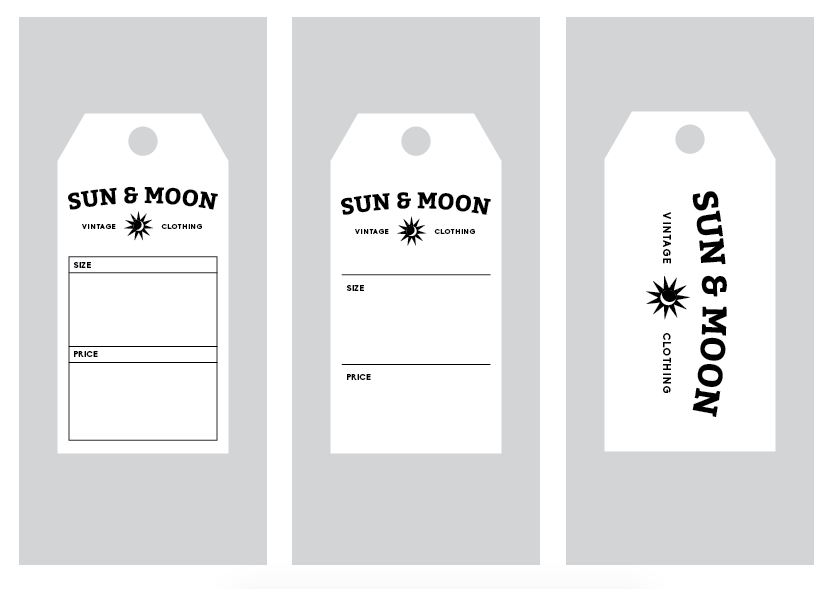
I started with the front, creating three boxes for the logo, size and price. The idea is that it will be a stamp, the the client can hand write the size and price as it will be different for each bit of clothing.

On the back I thought there could be a bigger version of the stamp.

I then tried it without the boxes which I also think would work. I tried this and the first design the same shape as the tag to get a better idea


I also tried having the captions boxed off, but I feel this looks a bit too contained perhaps

I then decided to create the correct measurements for the tags

I tried having just two boxes for the size/price but I don't think it looks balanced

I then tried just having a line above which I do think looks better

I moved the content around to make it look more balanced, but I think this is my favourite so far

I also tried the boxed version again, as I wanted two variations to send to the client

I then started to present them on a board ready for the client, trying to keep it in the style of the logos

I then realised it would actuall make more sense and look balanced to have grey backgrounds with white tags
Leave your comment