Coating
I coated the screen with emulsion after I had cleaned it, and let it dry for an hour. Then I exposed all three designs onto one screen.

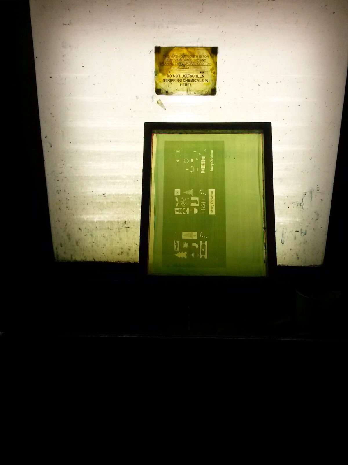
Then I washed it and waited for it to dry again before I could print.
Mixing Paints
I actually found mixing the paints quite tricky as I wanted very particular colours.
To get the green, I added white to binder and then kept adding a mixture of green and blue to get the colour I wanted. For the purple, I mixed cobalt blue, crimson and burnt umber. For the gold I just added pale gold powder to binder.

Printing
I started printing the purple as I figured this is the darkest and most used colour on the design. To line it up, I printed once onto true grain and then used masking tape to create crop marks for the paper.
At first the purple was really weak and wishy washy. To make it bolder, I added more magenta, and pulled it twice, which worked a lot better.


This is how it looks with two colours - just the gold to go now.


I then did the third colour, which was more tricky. It was a lot harder to line up than the first two
Here are a couple of examples that went wrong:


Leave your comment