As I had done the wireframes digitally, I could just change the colours and add the illustrations straight into the Photoshop file. It made the process a lot easier by doing the wireframes first.
Colour
I had quite a few blues and greens in my swatch panel that I've collected, and I knew I wanted to use one of these. Although I wanted to stay away from blue to make it different, no other colours were appropriate for the brand - aside from green.
I wanted to use it as an accent colour alongside shades of grey to make it stand out and keep it neutral and professional.

Walkthrough - Track Usage
When researching apps I realised a lot of them have walkthroughs - to show the main features of the app and how to use them. I decided to adopt this on the sign up/log in page so users see it straight away and can opt to view it. I started with being able to track your usage. I wanted to make the illustration a bit more interesting.

This looks like mountains

This grey box is the space that the illustrations have to fit into on the walkthrough pages

To make it more graph like I added sides and points on the graph, as well as change the shape

I added a stroke to the top to make it more defined

I felt that was too heavy, so I altered the colours to make it lighter

I improved the copy

Walkthrough - Water Meter
I then started working on the water meter illustration. I wanted to show what it looked like as well as say how to use it in the copy so users knew what to do. I made sure this and the usage chart didn't look exactly how they do in the app to make them more interesting and just for illustrative purposes.

I added more copy

I changed the decimal point to the darker green - I want all the illustrations to feature both greens to make them consistent


Walkthrough - Multiple Tenants
I decided to show a stylised version of how it would look on the app

Walkthrough - Reminders
I thought of some different icons that I could make, but I felt a bell was more fun and visually pleasing as well as representative
I tried these half shadows and I do like the effect it has, makes it more interesting

I went with completely flat in the end to keep it consistent

Walkthrough - Tips
As I am already showing a shower on the main page I thought I would do a different illustration here to show there's more to it
I tried it with the half shadow which I do like

But again, I went with the flat version to keep it consistent

Walkthrough - Payment
I decided an image of a wallet was appropriate
I felt the dark grey background was too bold with the green wallet and didn't work together

After the background change the tab on the wallet blended in with it

Using the dark grey stands out more

Sign up
I wanted to make the form simple and quick so the user doesn't get bored easily. I kept the fields flat and used long buttons to reflect a contemporary and easy to use UI.

Log in
I used the same format as the sign up page to keep it consistent. Both pages have an arrow which leads the user back to the walkthrough/launch screen.

Payment
This time the fields are long, and some of the information is already inputted for the user as it is provided to them - they can't change this. As there isn't that much content on this page, and illustration space is there to keep it interesting and make use of the layout. The bill breakdown is on another tab for the user to view to keep it from having a content overload.

Navigation
I used two shades of grey for the navigation at first, but felt it looked too bulky

I then used lighter shades and this lightened up the UI and made it easier to read paired with the darker text.


Submit Water Reading
I used the same format as the payment page to keep it consistent. All of the fields have automatic input so the user doesn't fill this in. The user does change the reading though, and they do this by dragging the numbers with their hand to change it.

I shortened the lines in the middle to make it seem more connected with the adjacent numbers. I also made the last two numbers of the reading a different colour to match the meter in its physical form.

Saving Water
There is a tab where the user can pick how they filter the information at the bottom. The lighter green indicates that is selected. The backwards arrow leads back to the saving water menu with all the tips they can look at.

I made the numbers at the bottom smaller which works better with the hierarchy. The background is also a lighter grey, which is consistent with the track your usage page.

The saving water contents could look like this, with green illustrations to liven it up.

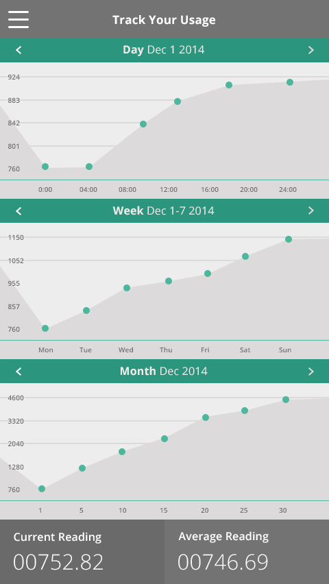
Track Usage
When I coloured the graph in green I realised how much green there was and it didn't look good at all as there was too much of it. It was a big, distracting block.

So I broke it down into three different graphs - filtered by date. However, I realised this was still too green and in your face.

I then tried three different colour combinations.

I altered these a bit, using green circle pointers and changing dark text to light on the green background.

I felt like using a dark green header with light green circle pointers was the right balance of colour and worked well with the grey. Using it as an accent looks more professional, and makes the graphs more readable.


I wanted the graphs to be accurate so that it looked more realistic and useful. I did a lot of working out to try and get an accurate representation of what it would look like. I worked out how much an average household would use in a day (164m3), and multiplied this for the week and month. I also based the figures around the reading that is on the submit water reading page - 00752.82

I then thought - should I add arrows so the user can change the day/week/month, as well as specify which day/week/month it is. This will give the user more accurate information.
I darkened the arrows on the right to indicate that you can't click on these as you are on the latest dates

I made the points on the chart as accurate as I could
I'm really happy with how the designs have turned out, and I have enjoyed doing my first app. I think it helped immensely to sketch first and do digital wireframes.
Leave your comment