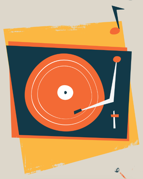
I wanted to keep a 1960s, fun style to reflect the era and upbeat rhythms of Motown music.
I started by making a record player, to reflect the era. I chose three colours based on different Motown posters that I've seen. They tend to be really bright combinations.
I started to experiment with using different shapes as borders. I also tried the record player in greyscale as it is common in Motown posters to have B+W photography surrounded by colour.
I also tried adding grain on the B+W to make it look more like a photograph style.
I started trying different colour combos to see if I liked anything else.
I liked this shape, as the background is in line with one side of the record player.
I added some music notes to make this section more interesting and bring it to life more.
I started to work on a skyline of Detroit. This is where Diana Ross & The Supremes originated, along with many other Motown artists.
Again I tried different colour combos.
I put the two illustrations together and started playing more with colour.
I went back to the original colour scheme as I think it reflects the era well and works well together.
I also started making the third illo, a signpost pointing backwards with a pair of eyes to reflect 'looking over my yesterdays'.
I also added a little bit of decoration around which is 60s style.
I tried a few different shapes..
Before settling on this
I went into Photoshop just to see if I liked the idea of rough edges on the background. I do like it, but I'm not sure if it is more appropriate than clean edges.
I then tried a grain texture on top which I think works well
I started adding more bits together and arranging the comp
At first I tried having a foot here to represent dancing/walking away. I couldn't get it to work so I moved onto something else for the meantime
I started working on a clock to show 'time after time'
I also started working on a tear pattern to show hollow tears. I thought patterns is quite 60s too
I didn't like it, I don't think it is very clear
I tried having a person crying but it just looked weird
I moved onto something else. I felt like love is the biggest theme in the song so I decided to represent that. The heart is in two colours/shapes to represent the unrequited love and differences
I decided to come back to this panel and make a window as that is mentioned in the song
I then went to this panel and created a foot illo here instead which I think works better
I came back to the tears and tried having a moon as it mentions crying at night but I didn't liek it
I tried a more fitting colour scheme but again wasn't keen on it
I tried a different shape moon which I prefer but I still don't like it
I decided to move the moon in the window panel which I think works better and makes this one more interesting
I changed the colour scheme to make it stand out more and be more appropriate to the context
Again, I went back to the tears..
I decided to try having more of a face/hairstyle which reflects the era and gives it more of a context
I think it's getting there more from the other versions
I tried to see how it was all looking together, and I think it is turning out good
I gave the lady a headband and made it a bit more uneven to fit in with the style
I made the tears blue so they stand out more
I tried it with the texture on in Photoshop and I really like how it is coming together
I made the lines thicker on the window decor
For the last panel I was unsure what to do. I decided a mirror was a good theme as it represents reflections
I also tried a few other things first..
But I decided to go back with the mirror. I added some decor around it in the form of twinkly stars.
Putting it all together I felt that the mirror wasn't quite right yet..
I added some reflection marks and changed the top of the mirror which I think looks a lot better, but it still wasn't there..
I made the mirror the same colour as the background which I think works a lot better now and looks more appropriate. I am happy with how it has turned out now!


Leave your comment