Archives

Brief 9: Secret 7 - Diana Ross - Evaluation

1.  What skills have you developed through this project and how effectively do you think you have applied them?
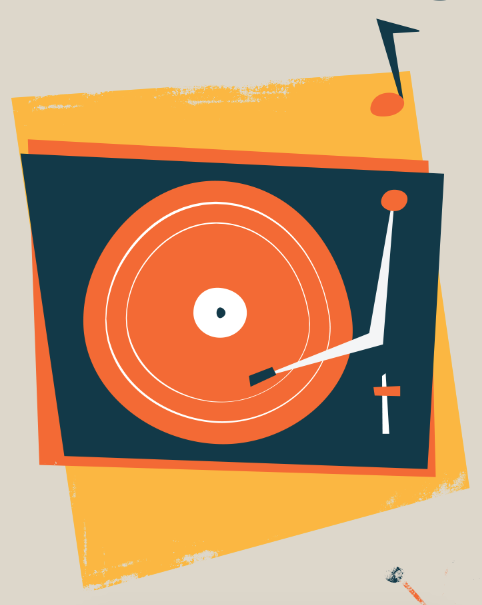
Illustration
I mainly developed my illustration skills during this project, and I worked in a more retro style than clean which I sometimes do. I did it in this style to reflect the era and the music, and I felt it was the most appropriate for the brief. I think I applied it well to the design and you can tell it isn't trying to mimic a contemporary style.


2. What approaches to/methods of design production have you developed and how have they informed your design development process?

Development
I spent the longest on the design development process, making lots of amendments and changes to get something that I was happy with and reflected the song and era well. I developed most of my ideas on screen rather than through sketches, and this worked well for this project. I knew what I wanted to illustrate, and it was more beneficial for me to work mainly on screen and develop things based on experiments that worked since the style requires lots of imperfections, different angles and elements such as backgrounds and add ons to get the look right. It was easier for me to do this on Illustrator than in sketches as I can see exactly how it is going to look and in colour right in front of me.

3. What strengths can you identify in your work and how have/will you capitalise on these?

Digital Design
I used both Illustrator and Photoshop to create the outcome, mixing vector illustrations with Photoshop textured brushes to create the effect. This is something I am comfortable with doing, and this year I have experimented with bringing illustrations into Photoshop and using textures and gradient maps and seeing how I can 

Contextual Knowledge
I love the song I was designing for as well as the band and era, so I already have quite a bit of knowledge on Motown and that era of music. This was an advantage because I knew what styles and colours would reflect that, and it also made the project a lot more fun - in turn making me very enthusiastic throughout. 


4. What weaknesses can you identify in your work and how will you address these in the future?

Thinking outside the box
Although I like the concept that I came up with and I am really happy with the outcome of the design, I feel like my idea was quite safe. Which is fine, but I could have produced more than one outcome to submit but I didn't really have anymore ideas so I only stuck to one. 


5. Identify five things that you will do differently next time and what do you expect to gain from doing these?

  • Do more! I should have submitted more designs for more songs to have a better chance of being part of the project

Brief 9: Secret 7 - Diana Ross - Final Design

Here is the final cover design. I am really happy with the outcome..


Here is it mocked up on a vinyl


Brief 9: Secret 7 - Diana Ross - Design Development

I went onto Illustrator to start digitising some of the ideas that I have.
I wanted to keep a 1960s, fun style to reflect the era and upbeat rhythms of Motown music.


I started by making a record player, to reflect the era. I chose three colours based on different Motown posters that I've seen. They tend to be really bright combinations.

I started to experiment with using different shapes as borders. I also tried the record player in greyscale as it is common in Motown posters to have B+W photography surrounded by colour.


I also tried adding grain on the B+W to make it look more like a photograph style.


I started trying different colour combos to see if I liked anything else.


I liked this shape, as the background is in line with one side of the record player.


I added some music notes to make this section more interesting and bring it to life more.


I started to work on a skyline of Detroit. This is where Diana Ross & The Supremes originated, along with many other Motown artists.


Again I tried different colour combos.


I put the two illustrations together and started playing more with colour.


I went back to the original colour scheme as I think it reflects the era well and works well together.
I also started making the third illo, a signpost pointing backwards with a pair of eyes to reflect 'looking over my yesterdays'.


I also added a little bit of decoration around which is 60s style.


I tried a few different shapes..

Before settling on this


I went into Photoshop just to see if I liked the idea of rough edges on the background. I do like it, but I'm not sure if it is more appropriate than clean edges.


I then tried a grain texture on top which I think works well


I started adding more bits together and arranging the comp


At first I tried having a foot here to represent dancing/walking away. I couldn't get it to work so I moved onto something else for the meantime


I started working on a clock to show 'time after time'


I also started working on a tear pattern to show hollow tears. I thought patterns is quite 60s too


I didn't like it, I don't think it is very clear


I tried having a person crying but it just looked weird


I moved onto something else. I felt like love is the biggest theme in the song so I decided to represent that. The heart is in two colours/shapes to represent the unrequited love and differences


I decided to come back to this panel and make a window as that is mentioned in the song


I then went to this panel and created a foot illo here instead which I think works better


I came back to the tears and tried having a moon as it mentions crying at night but I didn't liek it


I tried a more fitting colour scheme but again wasn't keen on it


I tried a different shape moon which I prefer but I still don't like it


I decided to move the moon in the window panel which I think works better and makes this one more interesting


I changed the colour scheme to make it stand out more and be more appropriate to the context


Again, I went back to the tears..


I decided to try having more of a face/hairstyle which reflects the era and gives it more of a context


I think it's getting there more from the other versions


I tried to see how it was all looking together, and I think it is turning out good


I gave the lady a headband and made it a bit more uneven to fit in with the style


I made the tears blue so they stand out more


I tried it with the texture on in Photoshop and I really like how it is coming together


I made the lines thicker on the window decor


For the last panel I was unsure what to do. I decided a mirror was a good theme as it represents reflections


I also tried a few other things first..


But I decided to go back with the mirror. I added some decor around it in the form of twinkly stars.


Putting it all together I felt that the mirror wasn't quite right yet..


I added some reflection marks and changed the top of the mirror which I think looks a lot better, but it still wasn't there..


I made the mirror the same colour as the background which I think works a lot better now and looks more appropriate. I am happy with how it has turned out now!


Copyright 2010. All rights reserved.

RSS Feed. This blog is proudly powered by Blogger and uses Modern Clix, a theme by Rodrigo Galindez. Modern Clix blogger template by Introblogger.