1. What skills have you developed through this project and how effectively do you think you have applied them?
Screenprinting
I haven't done any printmaking so far this year, so I wanted to get in the printroom while I had a spare few days before I went home for Christmas. Although I was in the middle of dissertation, I just wanted to create something fun and quick as a break from it.
I've always liked screenprinting, and decided to push myself a bit for this by printing three colours as I usually only do two. It was quite hard actually, and I only got a few good prints but the good ones came out really well and it made a big difference. I definitely learnt from it and refreshed my memory on how to print since I hadn't done it in so long.
2. What approaches to/methods of design production have you developed and how have they informed your design development process?
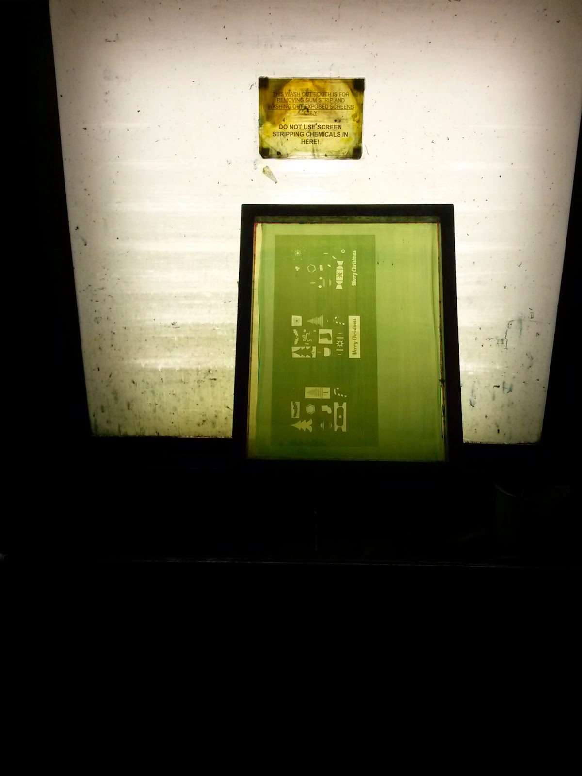
Screenprinting
The main element of the design production stage was screenprinting, and this informed my design development immensely. I needed a design that would work well with this kind of printing and I had to prep the illustrator file ready to print the 3 separate colours. This isn't something I usually do, and was good to refresh my memory on how to do it. I also knew that I could get different colours with screenprinting, so I kept in mind that I wanted to use metallic gold - something you cannot achieve with digital print - and worked my colour scheme around that.
3. What strengths can you identify in your work and how have/will you capitalise on these?
Illustration
Since it was my own project I didn't have to stick to any particular brief, my own illustration style came through strongly, and shows the kind that I like to produce. I think this is important for people to see what I am interested in, and doing this short brief reflects that.
Hands on
I came on the course as a designer with a hands on approach, and I loved papercutting, lino cutting and hand rendered type. Throughout the course of the degree, I have shifted into a web designer and everyone knows me for doing that. However, I do still enjoy getting my hands dirty and not sat in front of a Mac, so doing this project shows that I can do printmaking, and it is one of my skills - I am not limited to one thing.
4. What weaknesses can you identify in your work and how will you address these in the future?
Taking it Further
I feel I could have taken this brief further - I could have made envelopes, a box, and marketed it as a set of christmas cards to sell in a shop, online etc. I didn't because I only wanted to give them to family and friends, but it is definitely something I could have done to take the project further for Extended Practice. If I had more time, that is something I would go back and do.
5. Identify five things that you will do differently next time and what do you expect to gain from doing these?
- Pick better stock - colour and gsm that would work well for standing up and making colours stand out
- Envelopes - create matching envelopes to create more of a set
- Photography - set up a better photography backdrop with festive props