
Extended Practice
Danielle Harrison
Archives
Brief 2: An Illustration a Day - 13
I am going to Amsterdam so decided to draw one of the signature houses they have
Brief 6: Leeds Student Deals - Further Work
As the client was happy with the logo and banner, they have also asked for a voucher template. They want it to be 1200x400px, and this is an example of the look they want to go for.

Brief 6: Leeds Student Deals - Clients Choices
The client decided that they wanted Logo 15 and Banner 1. They asked for them both in EPS and JPEG formats. I'm glad I did a variation of logos and banners as it means I haven't had to change or create more designs, as the client had a good selection to choose from.


Brief 7: Design Something More - Crit
Today we had a crit of what we have done so far.
Notes
Notes
- Do they have a responsibility to use less water?
- Virtue to being local
- Personalising water
- Change relationship with it
- It can use humour and fun
- Comfortably tell a story
- What if Virgin or Innocent supplied water? You would expect a different experience
- Where is the money being spent?
- Awareness
Brief 7: Design Something More - Initial Thoughts
Water Supplier Experience
I have had a very bad experience with my water supplier recently, so I thought I would draw from that experience to see how it could have been prevented.
When I lived in a student house last year, with 12 tenants, we didn't actually realise we had to pay for water until we moved out. We assumed it was paid with the rest of the bills, and didn't realise Yorkshire Water existed.
From then, it was very tough getting money from 12 different people who didn't live there anymore, and one person had to have the burden of paying on behalf of everyone. So everyone had to pay one person initially before it got to the water supplier.
Concept
This would have been a lot easier and less painful if water was made simple. I thought of ways my situation could have been improved:
Problem
Solution
Problem
Solution
Problem
Solution
Problem
Solution
Why an app?
When I did a focus group last week asking people what apps they use for my dissertation research, I realised that people use banking apps a lot. Banking is considered boring, hard and inaccessible, but apps have made it possible to check and track money right at a user's fingertips. Fitness apps were also popular with people tracking their progress, which wouldn't otherwise be easy to do.
I was thinking an app would be a good idea because they could track water usage in a timeline, which wouldn't previously be easy to do - yet the data would be there. It would also mean its easy to check how much you owe whenever you want as opposed to waiting for a letter or ringing up the supplier.
App Features
What should be made simple?
I have had a very bad experience with my water supplier recently, so I thought I would draw from that experience to see how it could have been prevented.
When I lived in a student house last year, with 12 tenants, we didn't actually realise we had to pay for water until we moved out. We assumed it was paid with the rest of the bills, and didn't realise Yorkshire Water existed.
From then, it was very tough getting money from 12 different people who didn't live there anymore, and one person had to have the burden of paying on behalf of everyone. So everyone had to pay one person initially before it got to the water supplier.
Concept
This would have been a lot easier and less painful if water was made simple. I thought of ways my situation could have been improved:
Problem
- We didn't realise we had to pay any water until we moved out
Solution
- Raise awareness of the water supplier - people need to know they exist. People don't know they are assigned a supplier in an area so could advertise in Yorkshire
Problem
- It was very tough getting money from 12 different people who didn't live in the same house anymore
Solution
- Tenants should be made aware of when they can pay water ASAP - with an app notification and email. I rang Yorkshire Water and they said a letter would have been sent in April time saying we could pay - we either never received this or didn't open it. In student houses you get so many letters usually addressed to previous tenants so you don't really look at them.. plus we didn't realise we were expecting something from a water supplier.
Problem
- Person had to have the burden of paying on behalf of everyone. So everyone had to pay one person initially before it got to the water supplier.
Solution
- If there was a simple way to transfer money through an app, like ping it, it could go straight to the water supplier account, or through a singular person more easily
Problem
- The supplier didn't have the correct tenants names - this prolonged getting a letter to say the account had been closed because they were completely random, and they said they had no record of our names
Solution
- Input the names on the app so they always have the information - not just when you have a problem
Why an app?
When I did a focus group last week asking people what apps they use for my dissertation research, I realised that people use banking apps a lot. Banking is considered boring, hard and inaccessible, but apps have made it possible to check and track money right at a user's fingertips. Fitness apps were also popular with people tracking their progress, which wouldn't otherwise be easy to do.
I was thinking an app would be a good idea because they could track water usage in a timeline, which wouldn't previously be easy to do - yet the data would be there. It would also mean its easy to check how much you owe whenever you want as opposed to waiting for a letter or ringing up the supplier.
App Features
- Track usage if using a water meter on a timeline
- Personalised to their home
- Information about names on account
- Notifications and email when you can pay account
- Easy bank transfers
What should be made simple?
- How to pay the supplier
- How to get information regarding your account
- Knowing where water comes from
- Knowing where your money goes
- Keeping water wastage to a minimum
Further Research
- If letters are ineffective, how can awareness be raised?
- What would be the most appropriate tone of voice?
- Look at brands done well - Innocent, British Gas app, Centralway/banking apps, Google Now
Brief 7 - Design Something More - Talk
Do Something More came in to give us a presentation and brief to undertake.
Here are my notes
DSM
Opportunity to make a difference
Brand is about an idea, their view
Think beyond the logo
The Ministry of Wonderful
Brands have a duty of care to make our experience wonderful
Not changing what they do, change our relationship with them
1. Define
Here are my notes
DSM
Opportunity to make a difference
Brand is about an idea, their view
Think beyond the logo
The Ministry of Wonderful
Brands have a duty of care to make our experience wonderful
Not changing what they do, change our relationship with them
1. Define
- What should it stand for?
- Why should it exist?
- Why should people care?
- What makes it different?
Big idea, name, what you stand for
2. Create
- What does it look like?
- What does it sound like?
- What does it do?
3. Build
- Make stuff that's relevant
- What can we do with what we've created?
Can't change the product itself
My Brand
I got given water supplier to rebrand.
Brief 2: An Illustration a Day - 12
12
I am into fitness and fancied doing a textured effect today so decided to combine the two.

I am into fitness and fancied doing a textured effect today so decided to combine the two.


Brief 6: Leeds Student Deals - Evaluation
1. What skills have you developed through this project and how effectively do you think you have applied them?
Logo design is something I have previously shyed away from or become worried about as I feel it is a weak spot for me. So when the client approached me I was worried I wouldn't be able to deliver something good, but it went surprisingly well throughout the project. I completed the designs in less than a day, and ended up with more than 15 logo designs. Once I put my mind to it I was able to think of lots of ideas, so I feel I have definitely applied them for this project.
I also feel like I got to put into practice presentation skills again I created boards for the client, making them consistent, easy to understand, professional and presented the work to a high standard.
2. What approaches to/methods of design production have you developed and how have they informed your design development process?
I did do quite a few sketches for the logo design first of all as opposed to going straight to screen which I usually do. I think this benefitted me a lot because I was able to jot down quite a lot of ideas and ended up with a lot of digital outcomes as well.
I used Illustrator to do the logos which was good as I have been using Photoshop a lot lately, so this project helped me get back in the swing of it and remember all the shortcuts.
3. What strengths can you identify in your work and how have/will you capitalise on these?
I think the ability to design something in a short amount of time is something that I learned to do at my placement over Summer at Twentysix, and I've definitely carried that through this year with my projects. This week I have another project deadline, a focus group to conduct and dissertation to start writing so when the client came to me I was apprehensive about how much time I had. However, I was able to start and complete the project in a day so I still have enough time for my other tasks. I think that it's important to be able to work to a short deadline because you might plan your time in advance, but you never know when another project is going to come up within that time.
I also think my presentation skills have improved so much since last year, and this is a strength in my work, particularly when working for a client. It shows I am a serious and professional designer. By presenting the designs well I think it makes them look polished and more likely for the client to like them/imagine them using them.
4. What weaknesses can you identify in your work and how will you address these in the future?
As I've said, something I struggle with is logo design. I think that is my worst area at this stage, and although I have done a lot of designs for this project, I was worried about starting it at first. I think I just need to continue to practice - as when I was actually creating them it was quite fun and I had a flow of ideas - so I just need to continue doing this until I am confident enough to start a project without any worries.
5. Identify five things that you will do differently next time and what do you expect to gain from doing these?
I'm not sure I would do anything differently - I completed the brief I was given, in a day, went above and beyond for the client (15 logo designs) and sent it to the client, presented to a high standard, two days earlier than I said I would have it finished by. The client is happy with the work, and I am happy with what I produced so I wouldn't change a thing.
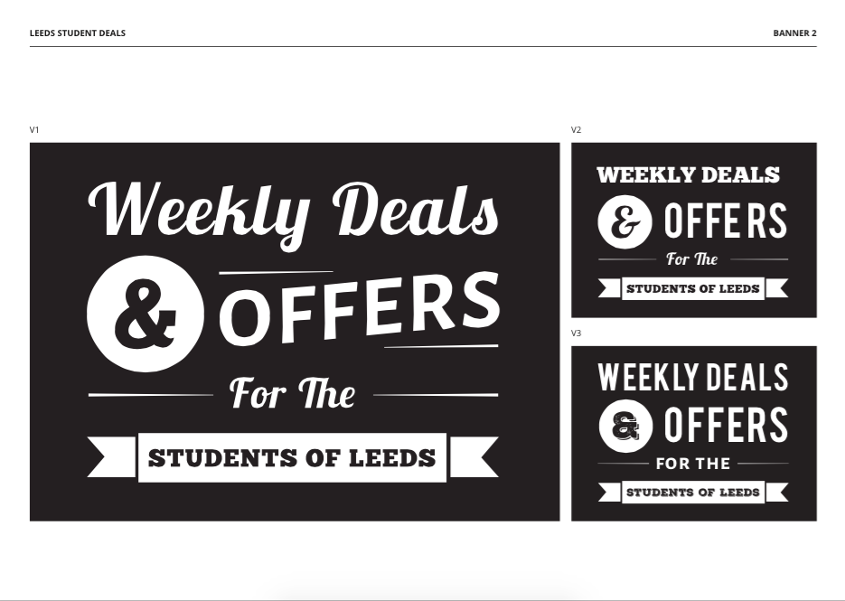
Brief 6: Leeds Student Deals - Boards
As I have finished the designs now, I wanted to put them into boards so I could send them to the client.
I wanted a title page so that when the client opened the boards they weren't bombarded with designs from the beginning.


I wanted a title page so that when the client opened the boards they weren't bombarded with designs from the beginning.
I started with the first banner design, showing what I think is the best version bigger then the two variations smaller next to it.
I then used the same layout for the 2nd banner.
I then showed them both in situ - one with a photographic background and one with a coloured background so the client can see how they would be used.
I then showed all of the logos on one sheet so the client can see them all at once. I also numbered them so that when the client will talk to me about them they can easily identify which ones.
I emailed these to the client and I got a quick response saying they were happy with the work, and a full email would be sent tomorrow. I am very glad they are happy with the outcomes, and I feel I pushed myself in an area I am not very confident in (logo design).
Brief 6: Leeds Student Deals - Design and Development
As this is a quick turn around brief, I did a few sketches then went straight to screen.
Logo
I opened up Illustrator and started digitising the sketches that I thought would work most. I want to create a variety of logos to show to the client so they have a wide choice. I would only usually do a couple, and I think it is best to try and keep going to see what else I can make. It improves my skills and provides a better outcome and service for the client.
Concepts
The client suggested shortening the logo to 'LSD' as something playful because it has a different meaning, so I wanted to show a couple of options with that. I also thought of having tickets being used, as they have connotations with vouchers/coupons which is what the site is for. I also
I ended up with nine, and I thought that is a good amount. But I want to do more. I have more sketches and I thought of more possibilities from these logos so I carried on.
I quickly added three more, and thought I wanted a couple more logos that weren't inside a box.
So I ended up creating 15. I ordered them so they made a linear sense. For example the logos that weren't inside a ticket were on the top line, the ones which are shortened to LSD are on the second line and the ones that are inside a ticket on the third line. My thinking behind this is that it would be easier for the client to follow the thought pattern, and see similar concepts grouped together.
After I finished these, an idea came to me for another logo. I thought about combining a graduation cap and a ticket to relate to the student/discount part of the name.
I thought this was a good concept as it combines two elements.
Banner
I then started to work on the banner. The client liked this design which was already on their wordpress site, but it obviously had the wrong copy. So I tried to create something in this style
I chose a suitable stock image, as I wanted to create a mock up of what the banner could look like on a relevant photograph.
I then started to develop ideas on illustrator.
I also tried it over the photograph to see how it would look.
After trying a few different fonts and variations, I settled on the two top designs here. Underneath them are two variations of each design (different fonts etc) so the client can see how it can be changed.

Brief 6: Leeds Student Deals - Research
I looked at a couple of typographic designs for when I started to create the banners, but as it was a quick turn around brief I didn't really do any research.


Brief 6: Leeds Student Deals - Brief
I have been approached by a client who is looking for two home page banners and a logo for a website called Leeds Student Deals. This is a short brief that I can fit in whilst doing dissertation work, and is a nice break from it.
Brief
Brief
Background
Considerations
Brief
Brief
- You have been asked to create two homepage banners and a logo for Leeds Student Deals. You only have a few days to create these and show them to the client.
Background
- Leeds Student Deals is a new company that offers different discounts for various things in Leeds.
- http://leedsstudentdeals.com/
Considerations
- Consider the audience - how will it appeal to them
- Consider how the banner will look on different backgrounds
- Consider how it will be viewed on screen.
- Students in Leeds
- Outgoing, looking for a bargain
- 700x500px - size of banner
- Two homepage banners
- At least three logo ideas
- Homepage copy 'Weekly deals and offers for the students of Leeds'
Deliverables
- Logo designs
- Two homepage banners
Brief 3: Adopt an Animal - Evaluation
1. What skills have you developed through this project and how effectively do you think you have applied them?
Web Design
Something I always want to improve on are my web design skills, and I feel I had the opportunity to do that with this project as it was the main aspect of it. I think I applied my skills as much as I could, as I created comprehensive pages for the site, and really thought about what to include, the content and how to push the design.
Presentation Skills
I have developed these skills throughout the project, by thinking how the person looking at the project will perceive it. I have tried to make it easy to understand through presentation, by sticking to the branding guidelines throughout the project, creating mockups and placing things in situ, as well as creating a video to visually show how the site works.
Branding and Story
I feel I have improved on my branding skills and thinking of the story behind the brand. I was able to think of why the charity exists and what they want to do, and creating the content of the project to revolve around this. I also felt like I was better at logo design this time round, as that is something I usually struggle with - coming up with a name etc. Because I created a story for the project, I felt that it was easier for me to design for. I also created a style guide for the brand - something I have always felt was a daunting task before this, but I felt it was a lot easier this time - and a lot more fun.
Video
It was the first time I had created a video, and it was definitely a skill I have started to learn. I really enjoyed the process, and I think I applied it as effectively as I could at this stage. There is more I wanted to add, but based on my skills right now it was the best I could do.
2. What approaches to/methods of design production have you developed and how have they informed your design development process?
Photoshop
I have become more competent with Photoshop by creating the website and social media assets on it. I have only started to use it this Summer, and feel like I am always learning when I use it and am becoming a lot more competent. By using it a lot, it made my design development process a lot smoother and quicker than it would have been in 2nd year.
After Effects
I decided to try this programme for the first time, and I was apprehensive at first as to how difficult it would be. Although it was fiddly, and I didn't produce exactly what I wanted, it wasn't as bad as what I thought it would be. I was pleasantly surprised, and I really enjoyed using it. It felt rewarding when I saw what I had achieved in a small amount of time. I can't wait to use it for the next project.
3. What strengths can you identify in your work and how have/will you capitalise on these?
Web Design
The main part of this project was the website. I wanted to do something where I could practice my web design skills, and felt this was a good project to start with. I definitely feel more competent this year when it comes to web design, and I felt like I actually designed it quite quickly. Whereas last year, this would have taken me quite a while. I feel I have improved when thinking of the user experience and how the user would interact with the website, and have taken these things into consideration when I was designing the site. During the crit we had a couple of weeks ago, everyone gave me really positive feedback about the website, so that also gives me the confidence to say it is a big strength in my work.
Social Media
During my placement throughout Summer at Twentysix, I worked on a lot of social media assets. I feel like I have started to incorporate it into all my briefs this year as I have realised how relevant and important to a brand it can be. I enjoyed doing the social media assets for this project - they are a quick, fun part of the project to do. I feel like in previous years if I had thought of doing them, they would have no substance to them, whereas this time I have thought about the content of the assets and what people would want to see/what the charity would want users to see.
Presentation
Something I have always overlooked in the past, I tried to allocate more time for the presentation of the project. This included placing the social media assets in situ, so people can see what they would look like and how they would work. Creating mock ups like this have become very easy to me now as I did a few of them while I was on placement. I also took the time to make a comprehensive style guide - something I wouldn't have done before. I tried to include as much information as possible and presenting it in a professional way. I think the main thing though, is the video I created for the website. Before, I would just present images of the web design, but now I feel I have bought my designs to life a bit more through this. It definitely gives people a better idea of how my website would work, and I have received positive feedback from my peers regarding it. This is definitely something I want to improve on, and continue with in forthcoming projects.
4. What weaknesses can you identify in your work and how will you address these in the future?
Video
As a complete novice when it comes to After Effects, I feel like this is a weakness in the project as there is a lot more I wanted to show via the video, but didn't have the capabilities to do it. Having said that, I am proud of what I achieved in a small amount of time as I thought it would be a lot harder than I found it.
Time Management
Usually I am quite good at this, but I feel like I could have condensed the amount of work that I have done in a shorter time scale. I feel I have been procrastinating more, when I should have just been getting on with it. Now I feel more motivated having finished this project as I am happy with the (video) outcome, and would like to do it more.
Wireframing
Something that I really need to practice is creating wireframes for my web designs. At the moment I just draw a few sketches, but they have no real accuracy to them and aren't very professional. This is something I need to work on to become more professional and improve on my web design skills.
5. Identify five things that you will do differently next time and what do you expect to gain from doing these?
- Keep practicing and improving on After Effects. This was my first time using it, so I didn't expect the video to be very good but now I have started to learn the basics I should keep improving with each one I do.
- Work more efficiently - when I did work, I did it quickly, but looking back I could have condensed it all in a shorter timescale. This will allow me to fit more work in and be more productive.
- Be more confident - I could have been finished with the website a lot sooner, but I kept umming an ahhing about whether it looked good or not, and wanted feedback on a lot of things when really I should have just trusted my own decisions to save time.
Brief 3: Adopt an Animal - Animation
I decided as the home page only took a few hours to animate, and I was more familiar with After Effects now, that I would animate all of the pages.
This took me near enough the same time it took me to do the home page as I had gotten used to the interface now. I am happy with the outcome, although it is far from perfect. There is a lot more that I would have wanted to do, but I decided to keep it basic for now due to my experience (or lack thereof).
Video
I uploaded it onto Vimeo. At first it was too big, so I had to export it on Premier Pro to make the file smaller.
The Primate Project from Danielle Harrison on Vimeo.
Brief 3: Adopt an Animal - Home Page Animation
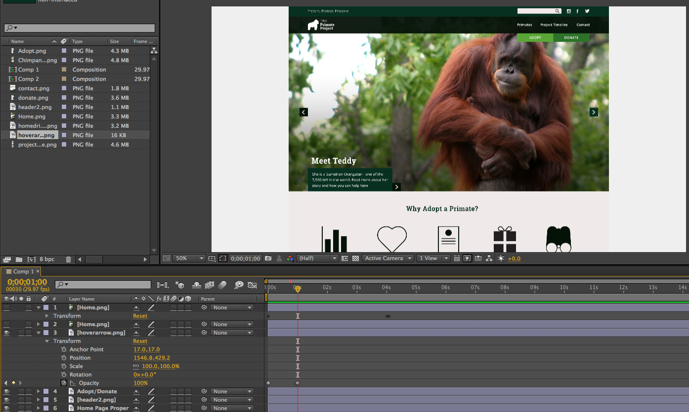
I really want to animate the website, to show how it would work. I think that is a better way of presenting what I have done than just having boards, as it is supposed to be interactive.
I feel this would be really beneficial to learn this year, as a lot of my briefs are websites. I've decided to use After Effects to do this. I just want the video to scroll, and then where there are functions, for those to be shown. I have never used this program before, so I am a bit clueless as to where to begin.
After Effects Development
I began by putting all of the pages that I am going to use into the project as PNGs.

I then dragged the home page into the composition as I want to begin with that. By clicking on the down arrow, I can find the different functions I can apply. As I want to scroll down the website, I want to change the position. By clicking on the stopwatch, I can add a keyframe. I clicked on four seconds, and this added a keyframe here. I moved the website into the position I want it to be seen there. Then I clicked on 0s, and moved it back to the beginning. This has already created a scrolling effect.


I feel this would be really beneficial to learn this year, as a lot of my briefs are websites. I've decided to use After Effects to do this. I just want the video to scroll, and then where there are functions, for those to be shown. I have never used this program before, so I am a bit clueless as to where to begin.
After Effects Development
I began by putting all of the pages that I am going to use into the project as PNGs.
I then dragged the home page into the composition as I want to begin with that. By clicking on the down arrow, I can find the different functions I can apply. As I want to scroll down the website, I want to change the position. By clicking on the stopwatch, I can add a keyframe. I clicked on four seconds, and this added a keyframe here. I moved the website into the position I want it to be seen there. Then I clicked on 0s, and moved it back to the beginning. This has already created a scrolling effect.
When doing the slider, I didn't want these buttons to move, so I dragged another copy of the home page into the comp. I then right clicked to make a new mask. I then drew a mask around the buttons with the rectangle tool at the top. I can now put the header2.png I have made (the new slider) in between this layer and the home page. This will make the buttons appear not to move.
To make the slider, I just moved the position outside of the home page to the right, and changed the opacity to 0%. Then I changed it too 100% when I need it, and slid it into the position I wanted, a few seconds later.
I wanted it to slow down as it nearly gets into position, so I added another keyframe when it neared the end and made the gap bigger.
By pressing the ~ key, on whichever box I have highlighted it puts it into a bigger view. This is helpful when looking at the layers as it can get quite small at the bottom.
After I was happy with the video, I wanted to place it into another composition so I can add a browser window and scale it. To do this, I made a new composition. Then I dragged Comp 1 (what I had been working on) into the timeline. This allows me to scale it all as one piece. After I scaled it, I imported in the browser window I had made and scaled that too. Then I made a shape layer, and added a drop shadow and placed it behind the comp to add a bit more depth. Then I went onto composition, add to render queue, and this is where I can start to save it. Once I had okay'ed all of the settings, I could press render and save it.
Here is the video for the home page:
I do want to make each page into one continuous video, but for now this is okay as it took me a while to learn it today. I think I will be quicker in the future, but I want to leave it as a separate page at the minute as I am learning.
Subscribe to:
Posts (Atom)
Copyright 2010. All rights reserved.
RSS Feed. This blog is proudly powered by Blogger and uses Modern Clix, a theme by Rodrigo Galindez. Modern Clix blogger template by Introblogger.